
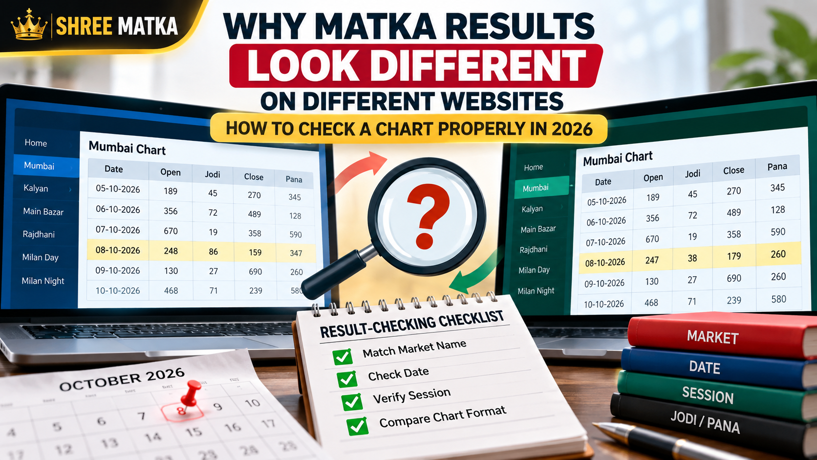
When someone searches for a Matka result online, one of the first things they may notice is that two websites do not always look exactly the same.
The market name may be written differently. One page may show a Jodi, another may show the full Pana-Jodi-Pana format, and a third page may still be showing yesterday's information.
That does not automatically mean that one website is deliberately publishing a false result.
Sometimes the difference is simply a matter of timing, formatting, delayed updates, or an incorrectly read chart.
This is why knowing how to check a result is more useful than simply looking for the biggest or most colorful number on a page.
The first thing to check: are you looking at the same market?
This sounds obvious, but it is one of the easiest mistakes to make.
Names such as Kalyan, Milan, Rajdhani, Main Bazar and other market names can appear across many chart pages. Some websites also use shortened names or slightly different naming conventions.
Before comparing two results, check three things:
A result can look "wrong" simply because two different sessions were compared.
Jodi and Pana are not the same thing
Another common source of confusion is comparing a two-digit result with a three-digit panel.
A Jodi is displayed as a two-digit pair, while a Panel, Patti or Pana is shown as a three-digit combination.
For example, a chart might display an entry in this form:
The three parts represent different pieces of the same result record.
A reader looking only for 38 might think another website is showing a completely different result because that website displays the full panel information instead.
The formatting is different, but the underlying record can still refer to the same session.
Timing can make two websites look different
This is probably the most practical point to understand.
Online result pages are not necessarily updated at exactly the same moment.
One website may update immediately after receiving the result. Another may update a few minutes later. A cached page can take even longer to refresh.
That means a quick comparison can produce something like this:
- Website A: updated result
- Website B: previous result still visible
- Website C: partially updated chart
This becomes particularly confusing on pages that show a weekly grid.
Before deciding that two sources disagree, refresh the page and check the timestamp or update information where available.
Weekly charts and daily result pages serve different purposes
A daily result page is designed for quickly checking a particular session.
A historical chart has a different job.
It organizes many previous results into a larger structure so that readers can look backward through dates and markets.
MatkaFun's chart pages, for example, use weekly calendar-style tables for historical Jodi records, while Panel pages contain the larger three-number result structure. You can also explore all market archives on the dedicated charts directory.
This distinction matters because a reader may compare a compact daily result against a historical table and assume the two pages are reporting different information.
They are often just presenting the same type of data differently.
Watch out for copied charts
There is another problem that is less obvious.
Many websites publish numerical charts, and some simply copy data from elsewhere.
Once an incorrect number enters a copied chart, the same mistake can appear on several websites.
That creates a false sense of confirmation.
Seeing the same number on five websites does not necessarily mean that five independent sources verified it. They may all have copied the same original entry.
For that reason, the number of websites displaying a result is less important than whether the source has a consistent update process and a clearly organized historical record.
Don't confuse a missing result with a zero
Charts can also use different symbols for information that has not yet been published.
Depending on the design, a page may show:
--**Pending- or simply leave a cell blank.
Those symbols should not automatically be interpreted as a numerical result.
This is particularly important when looking at a current week's chart, where some dates may still be incomplete.
Read the table heading and legend before interpreting an empty or placeholder cell.
How to compare two charts correctly
There is a very simple method.
- Start with the market name.
- Then confirm the date.
- Then identify whether the page is showing the Open, Jodi, Close, or complete Panel record.
- After that, check when the page was last updated.
Only after those four checks should you compare the numbers.
This takes less than a minute and eliminates many of the mistakes that happen when people compare charts by appearance alone. If you want a deeper breakdown of how panels and jodis relate, our Jodi and Panel chart guide explains the full mathematical structure.
A simple example
Imagine one website shows:
At first glance, these pages appear different.
They are not necessarily reporting different results.
The first is showing the complete record, the second is displaying only the Jodi, and the third is placing the same information into a historical calendar.
The important skill is learning to identify the structure of the chart before comparing the numbers.
What a historical chart can actually tell you
Historical charts are useful for organizing past records.
They can help you answer questions such as:
- When did a particular result occur?
- How is a market's history organized?
- Which dates are recorded?
- How frequently does a particular digit or combination appear in the historical dataset?
- What was the complete Panel associated with a recorded Jodi?
Those are questions about past data.
A historical chart should not be presented as proof that a particular future number is guaranteed to occur.
Past results are records of what happened, not a guarantee of what happens next.
A better way to use online charts
The internet has made historical result data much easier to access, but it has also made copied and poorly maintained pages easier to find.
A good chart page should be easy to read.
The market should be clearly identified.
Dates should be visible.
The table structure should make sense.
Historical records should remain consistent.
And the page should make it obvious whether the information is historical, currently updating, or incomplete.
These basic qualities matter more than flashy graphics or claims about "fixed" numbers.
Final thoughts
If two Matka websites show different-looking results, there is no reason to jump immediately to the conclusion that one of them is fake.
First check the market, date, session, format and update time.
Most simple discrepancies can be understood once those details are separated.
The bigger lesson is equally simple: learn to read the chart before interpreting the number.
For readers using online Matka records in 2026, basic source-checking and careful chart reading are more useful than blindly trusting whichever result appears first in a search result.
Comments (0)
Loading comments...